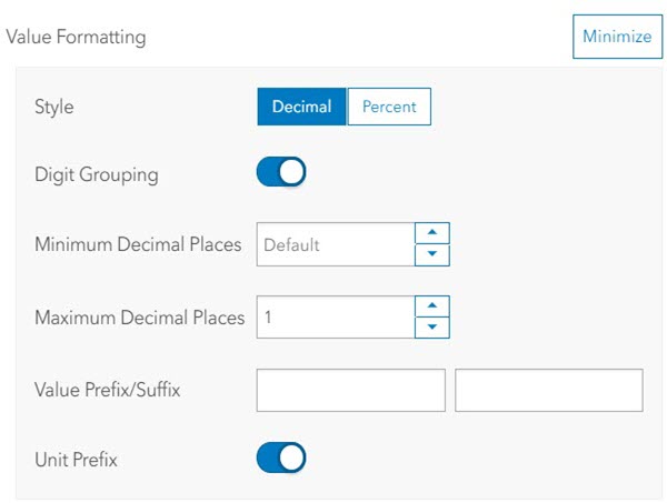
In places where numbers are shown, ArcGIS Dashboards attempts to format number patterns to match those typically used based on your locale. Dashboards determines your locale based on either the language setting in your user profile or, if you are accessing dashboards anonymously, the language setting in your web browser. This means that culturally sensitive patterns are used for representing values such as thousands, decimal separators, and percent signs.
For example, the number 1 million with two decimal places would be displayed in a dashboard as follows:
- 1,000,000.00 for Canadian and American users
- 1 000 000,00 for French users
- 1.000.000,00 for German users
When the default locale-specific formats aren't appropriate, you can override them by specifying different patterns using the Formatting settings found in the gauge, indicator, serial chart, and table elements.

Formatting allows you to configure the pattern of number values in different places of your dashboard's elements. For example, when configuring the value axis of a serial chart, if your numbers take up a lot of space, you can set a maximum number of decimal places you want to appear.
Depending on your element's configuration, you can format values, percentages, and ratios.
Use the Unit prefix toggle button to enable the unit prefixes configured in your dashboard settings and use Digit grouping to add or remove thousand separators. Additionally, you can choose to include a prefix or suffix to your values.